Studio__TommyField Notes
Show
drag the table around · scroll or pinch to zoom · move a note and it stays put
Hello, I’m Tommy, a designer in Edinburgh working as Studio__Tommy. These are my field notes: essays, half-formed thoughts, doodles and things I’ve found, kept in the open while they’re still growing. It’s connected to my own notes app, so don’t expect any super polished essays! (well not all the time at least)
It’s laid out like my desk rather than a blog. Every note is a scrap of paper on the table, and the string between them shows which ones link to each other. Drag the table to move around, scroll or pinch to zoom, and click a note to read it. If you move a note it stays where you put it, marked with a small pin, and “tidy up time!” puts everything back. There are a few objects on the desk too: the calendar shows today’s date and the music player shows what I’m listening to.
Notes come in kinds, each with its own shape and colour: essays, thoughts, inspiration and doodles, with more as they turn up. Some are seedlings, some are further along. The dotted outlines are ghosts, ideas I’ve linked to but haven’t written yet.
Why like this? I don’t think in a straight line, and a feed of newest-first posts hides how ideas lean on each other. If you’d rather read it the usual way, the feed lists everything with the newest on top but note they are subject to change.
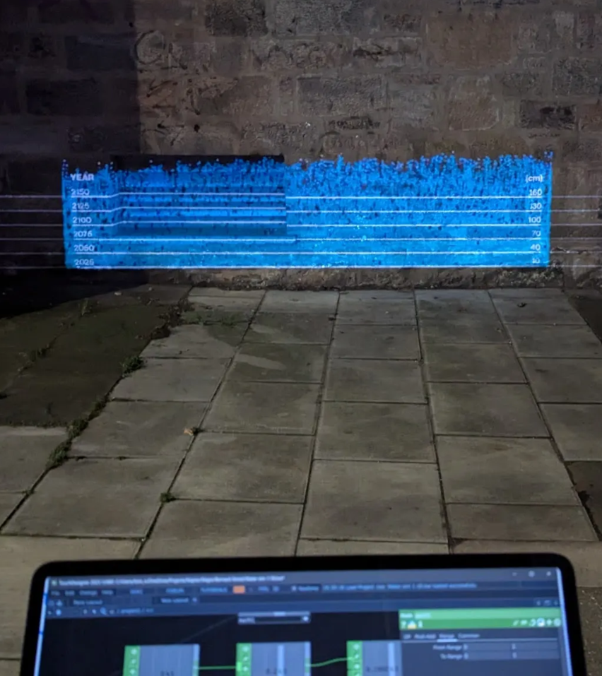
Notes on my first intervention for Waters of Leith
📌
💡 I need to write up what happened on during the experiment, add some pics too. What worked, what didn’t work. I should also define the metrics and methodlology for assesment. Integrating the “poems” method can help with standardising my observations during my reflections. I could also create “spider” diagrams or a points marking system.
Details
| Intervention | Water projection on to wall |
|---|---|
| Where | Wall behind Sainsburys on Bernard Street. |
| When | 07/10/25 7:47-8:32pm |
| Count | 19 people interacted, 7 spoke too. |
Description of set up
A portable projector on a tripod connected to my laptop, all running on battery power.
Simulation running on Touchdesigner, a 3d Nvidea flow particle system flooding a box container, with some basic manual controls for splashing, splitting the water, turning off and on rain, and resetting the system.
Music was also played from a high quality speaker towards the end of the session.
https://open.spotify.com/playlist/6bvdirvrXOhIDNgR9uAU8n?si=132c6ebac3974cfc
happenings
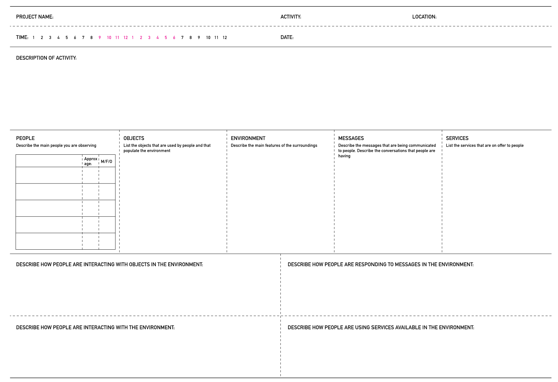
poems
A field trip for my dLab 2 (Design for Environmental Change) class. We visited the Royal Botanic Gardens here in Edinburgh. I had a few thoughts 1 on my mind as we wondered through the garden and I thought I’d write them up a bit more and flesh them out.
Rachel, organised the trip to show us how “Nature Based Solutions” might start to temper our design thinking to be more inline with the system we are working in and its many Entanglements. We we’re also able to attend two exhibits/gallery’s. One named “Grasses” and the other “Earth Matters”.
Raingardens and Nature Based Solutions
Our world is facing interconnected climate and nature crises. Global temperatures are rising, rainfall patterns are becoming more extreme, and species and ecosystems are degraded and lost. Here in Scotland, temperatures are increasing across all seasons, winters are becoming wetter, summers drier, and sea-level rise continues to accelerate.

With many people making their homes in towns and cities, these changes are increasingly felt in our daily lives. Intensified flooding and drought affect heavily modified urban landscapes, heatwaves are amplified by the streets and buildings that surround us, and stark inequalities persist in both health outcomes and access to nature across neighbourhoods. People are a part of the natural world, so climate and nature crises are ultimately people challenges too. When we address these interconnected issues all together as “the big picture” we have an opportunity to do things differently, rethinking how we plan, design and manage the places where we live. We can create something better, more resilient, sustainable, and equitable than what we did before.

This integrated action research is the field of nature-based solutions:

“actions to protect, sustainably manage, and restore natural or modified ecosystems that address societal challenges effectively and adaptively, simultaneously providing human wellbeing and biodiversity benefits"

- International Union for Conservation of Nature and Natural Resources (IUCN). This definition was adopted at the 2016 IUCN World Conservation Congress with the Resolution 6.069 (WCC-2016-Res-069).
The Raingardens
Are a number 2 of interventions to help the Botanics cope with the increasingly wetter winters, and perhaps to explore less “forceful” forms of gardening. Using a mixture of Sustainable Urban Drainage Systems (SUDS), drainage ditches, and particularly thirsty plans 3 .
The first one we saw was the newest, the Oak Lawn raingarden. There used to be a big old sycamore on that spot, and its roots were quietly doing loads of work holding the hillside together and soaking up water. When it got sick and had to come down, all that water started heading for the John Hope Gateway instead. Back in 2024 the Botanics worked with Heriot-Watt to make a hydrological map of the whole garden, basically simulating a big storm and seeing where the water ends up pooling. The Gateway is one of those low points. So now there’s a drain across the path that spills into a little stream in the lawn, and the shape of the ground and the planting slow it down until it ends up in a wallow where it can just sit for a while. The tree in the middle (a cork oak) gets its own wee island so it doesn’t get its feet wet. Part of it was designed by the RBGE horticulture students too, which I liked.
The second is the flagship one, the original raingarden from 2019, also done with Heriot-Watt. This is the success story. They don’t water it at all, the plants are doing great, and it hasn’t flooded since, not even in the July 2021 storm which was meant to be a 1-in-150-year one. The bit that got me was the soil. They use more organic matter than you’d normally put in a SUDS, so the plants actually thrive rather than just cling on, and end up being active partners in moving the water around (drinking it up, sweating it out 3). They’ve also been tweaking it as they go, pulling out some of the giant rhubarb (a bit invasive) and letting the umbrella plant and teasel fill in instead, and swapping a strip of grass at the back for trees and ferns.
The third was the stormwater planters, which are less of a garden and more of a clever box. A roof funnels all the rain that would have fallen on that patch of ground into one gushing drainpipe. Instead of that going straight into the drains, it gets piped into a planter, the plants drink it, the roots and soil filter it, and whatever’s left over gets held and let out slowly. Some of them are part of Climate Ready Craigleith with Scottish Water and have sensors at four different depths, so a PhD student can see how different plant mixes change the flow. The timber cladding is larch from their Benmore garden, felled because of phytophthora, which is a nice little reminder that climate change isn’t just storms, it moves pests and diseases around too. The two at the back were originally at COP26 and have one of the rarest plants I’ve probably ever walked straight past, the alpine blue-sow-thistle.
What I really liked across all of it was how they talk about it. Every stop on the tour had a section called “What are we learning? So how are we adapting?”. They call it Adaptive Management: make a plan, try it, monitor it, adjust, go again. Which is… just the design process? Iterate. But with plants, and over years rather than sprints. There’s something reassuring about a big respected institution openly going “that bit didn’t quite work, so we changed it”. It feels less about forcing the garden into a shape and more about working out what the water wants to do and giving it somewhere nice to do it.
Other bits
There was a lot more than just the raingardens. The Living Lawn is a lawn full of low wildflowers instead of one type of grass, and an MSc study found it soaks up more water and holds more life than the normal lawn next door, so now they just mow it less. Running through it is a new River of Flowers, a meandering strip of native wildflowers sown this June and left to grow wild. It’s meant to look like a river wandering across a floodplain, but made of flowers, and acts as a seedbank for the rest of the lawn. Lovely idea.
On the green roof, the tour script talked about the “messy middle” of nature based solutions, where the maintenance falls through the cracks between departments and nobody really owns it. That felt very familiar from basically every organisation I’ve ever worked with.
Trees as cool blankets
Something Rachel said stuck with me: trees aren’t just for shade, they act as “cool blankets” for the city. I knew they were nice and shady, obviously, but I hadn’t thought about them as a sort of mini AC unit before. I’d been thinking of it as convection, but it’s as much the sweaty plant thing again 3. They pull water up out of the ground and let it evaporate off their leaves, and evaporating water takes heat with it. So a tree is actively cooling the air around it as well as blocking the sun. You could really feel it on the meadow path by the West Gate, under the canopy, then stepping back out onto the sunny lawn.
The exhibits
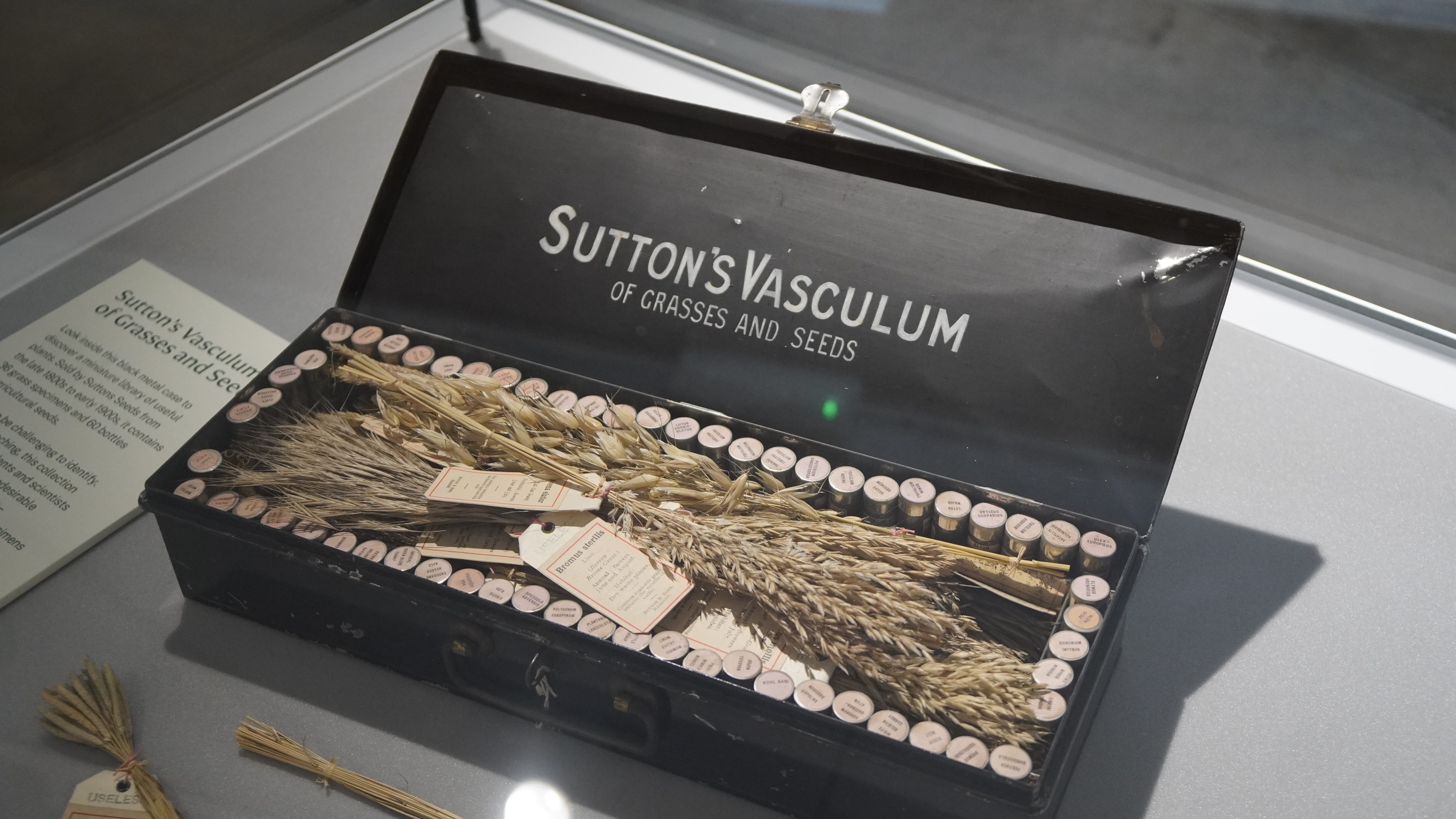
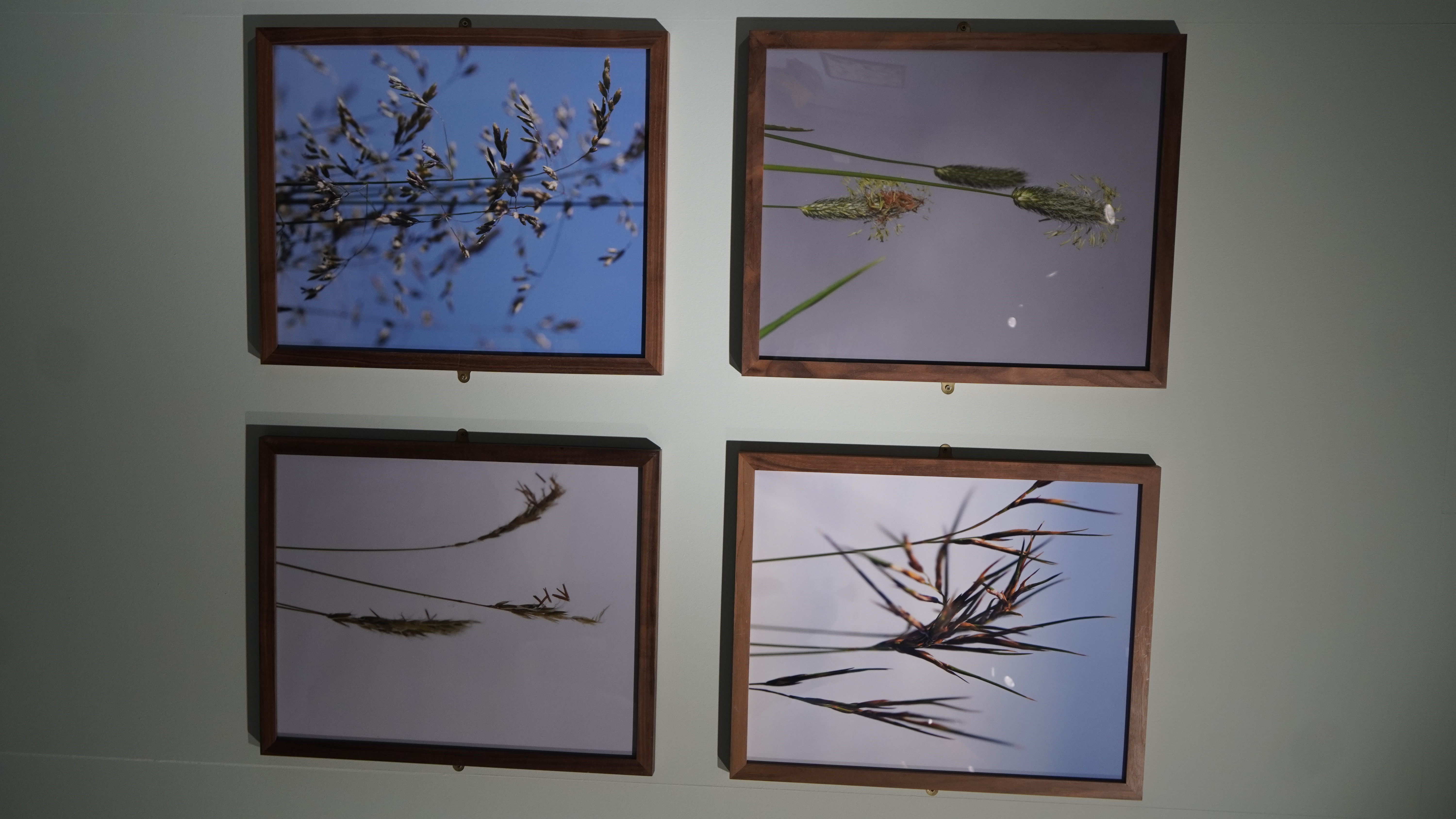
Grasses
Small but nice. Some beautiful weaving displays and a few books I want to check out. Hubbard’s Grasses was on display, which got me a bit. My grandfather, my dad, and I all own a copy. It was always more relevant to their fields (biology, agriculture) than mine, but it was nice to see it there, like spotting someone you know across a room.
Earth Matters
The thing that grabbed me was a Dorodango 4. I’d completely forgotten about them, but when I was a child I was obsessed with the idea of making one. I think I learnt about them from a Mythbusters episode. A ball of mud, polished by hand until it shines like a marble. Might have a go.
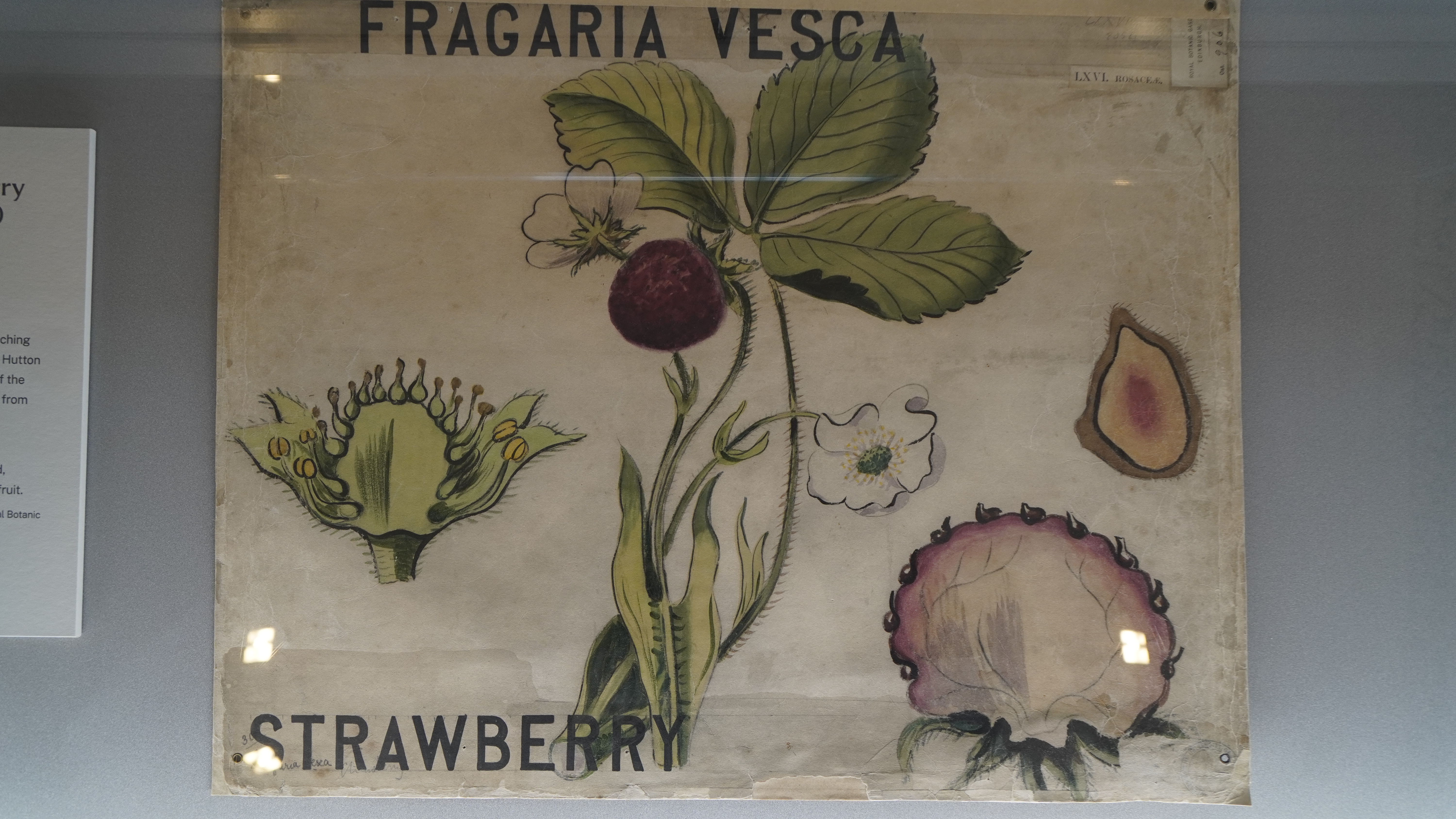
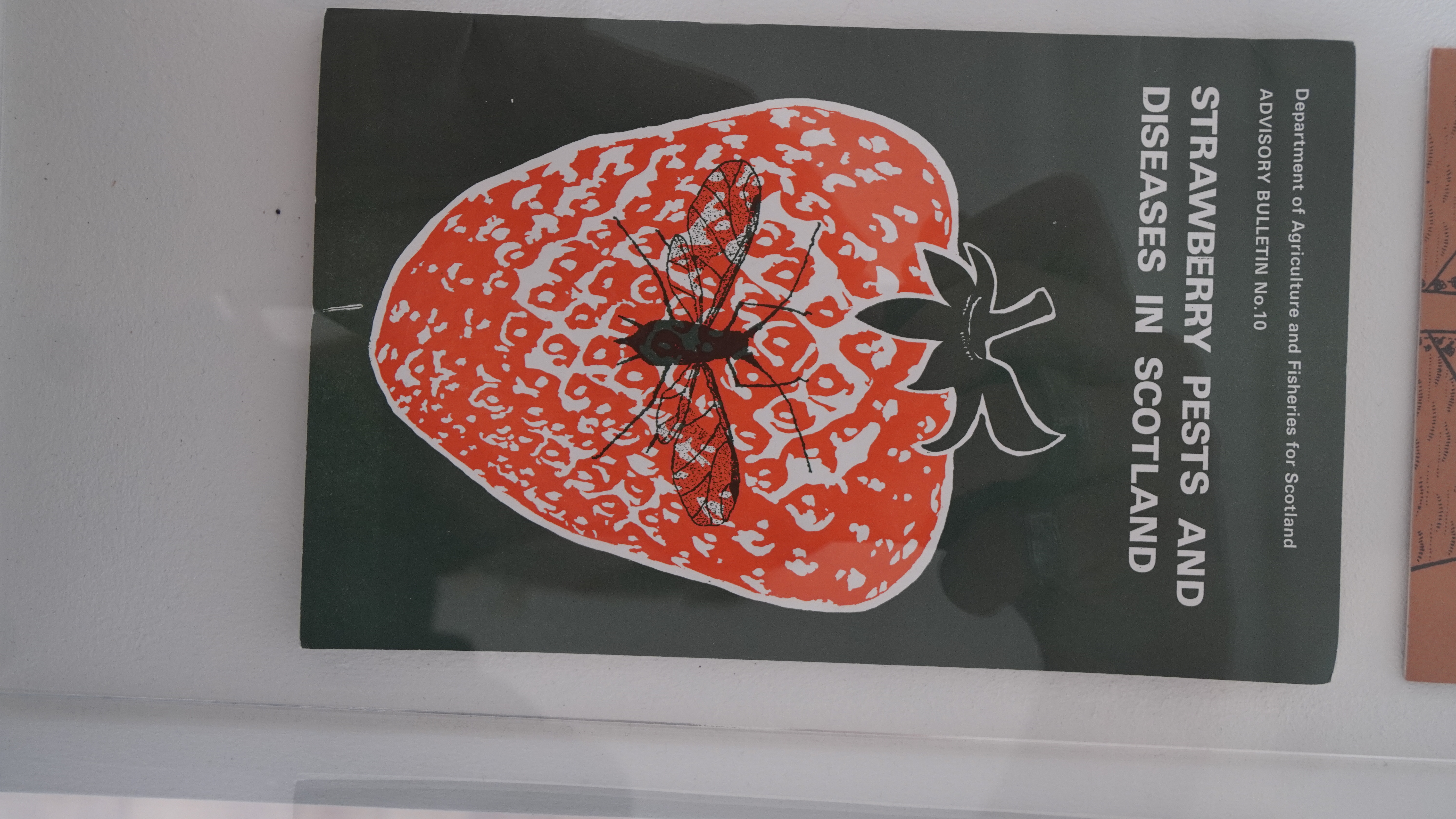
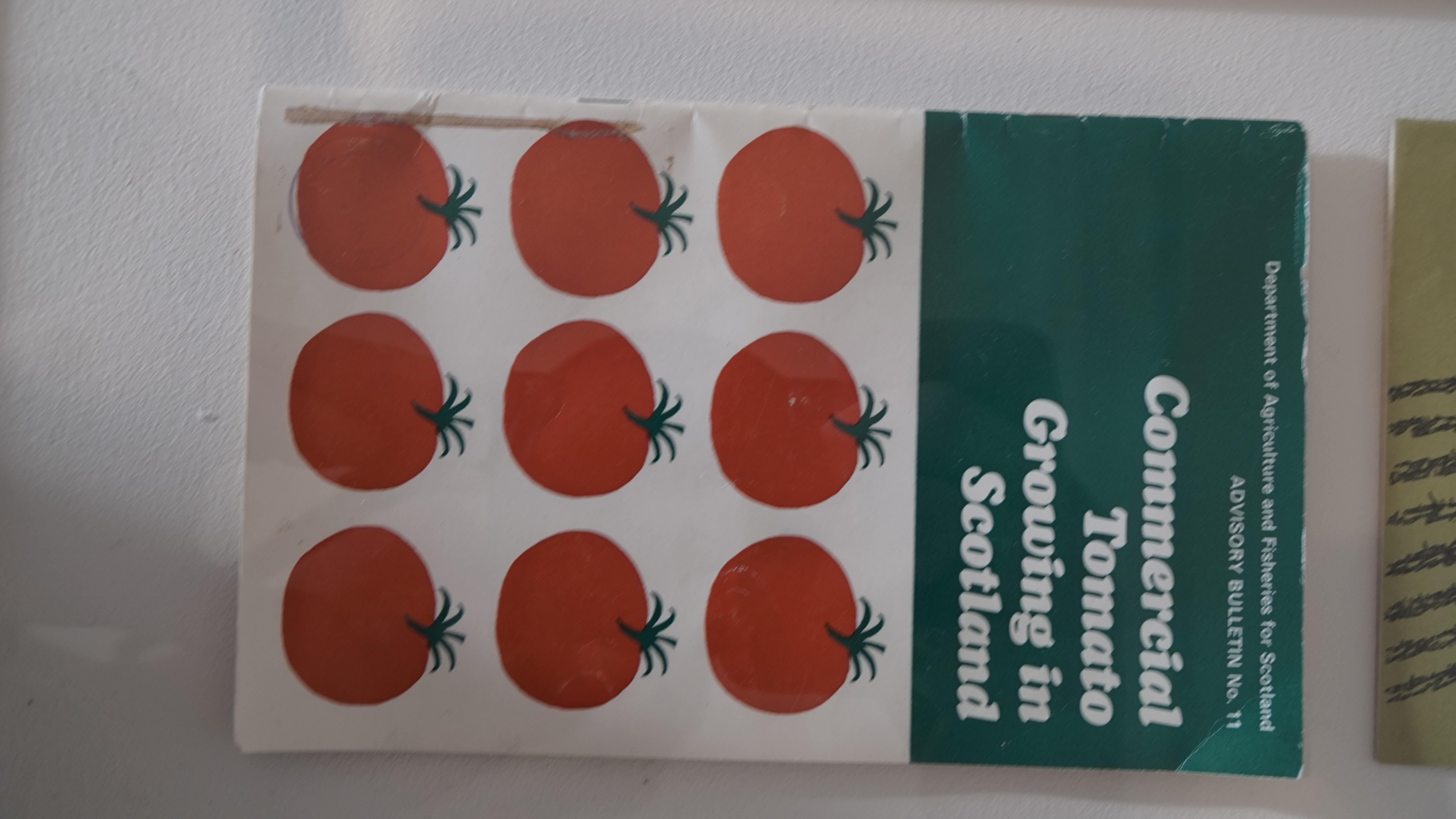
Whilst maybe not the focus of the exhibit, I also found some beautiful old documents that seem to be from the Scottish government. One was on growing tomatoes. They had that lovely modern (as in the 1950s–1980s) design to them and reminded me of the EPA and NASA stylebooks. Proper public information design.
The new look
Who did the facelift for the gardens? The graphic design I mean, I think it’s changed since I was last here. It’s nice, sort of fine arty and authoritative at the same time. It uses one of those engraved or semi-serif typefaces you see everywhere these days (especially in posh restaurants), but it works here. Not as boring and authoritative as a grotesk, and not too dated like a Garamond. It’s also nicely executed and broad in how it’s applied. They’d really touched every bit of the garden with it: flat but earthy colours, white for the text, and then lots of photos, photos of people and plants, which adds that human touch.
Found out. It was Johnson Banks, back in 2024. The typeface is a custom one called Sibbaldia, a tweaked version of Nomada Incise. So “engraved” wasn’t far off: it’s literally an incised face, made to look chiselled. Named after the wee alpine plant in their logo, which is named after Robert Sibbald, who founded the garden. Nice bit of circularity. The capitals were on purpose too, meant to feel more Royal. And the people-and-plants photos I liked came from a big shoot across all four gardens by Eilidh Cameron. So that human touch was very much the plan. Pleased my eye wasn’t totally off.
Anyway, lots to chew on. Want to go back in the summer when the River of Flowers is properly going.
So in some ways they are more "sweaty" than "thirsty" ...gross.
Footnotes
-
I have so many new thoughts on my mind at the moment. Studying at ECA has been as if I were on a pebbled coast, laying on my back and waves ebbing over my face and mind. I’m trying my best to hold onto them and stick them to my Gumball of thoughts and ideas. ↩
-
3 I think.. At least that’s what I saw. ↩
-
“Thirsty” plants are ones which drink a lot of water and then have a large surface area for persiprating this water back into the atmosphere. ↩ ↩2 ↩3
-
Dorodango (泥団子) is Japanese for “mud dumpling”. You shape mud into a ball, then keep dusting it with finer and finer dirt and rubbing it until it goes glossy. Takes hours. Very patient craft. ↩
Prep for my viva for Waters of Leith
opening
Rather than proposing a single solution to flooding, this project explores how design can create space for people to think, speak, and imagine together about uncertain futures.
The three parts you’ve seen aren’t separate outcomes — they’re different entry points into the same conversation, each designed for a different kind of participation.”
q&a
1. “Why three parts? Why not one ‘strong’ outcome?”
“The project isn’t three outputs — it’s one conversation happening at three levels: participation, imagination, and legacy.”
2. “How is this design, not art or activism?”
“The role of design here is not to declare a future, but to structure how futures are imagined, shared, and made legible.”
3. “What evidence do you have that this actually works?”
“At this stage, I’m testing whether people want to engage with future flood imaginaries — not whether those imaginaries are ‘correct’.”
4. “How do you avoid being extractive when working with communities?”
“I’m careful not to ask communities to carry the emotional or cognitive labour of ‘fixing’ climate futures — only to share how they imagine living with them.”
5. “What is your role here — designer, facilitator, author?”
“I see my authorship in the design of the system, not in the futures it produces.”
6. “Why focus on imagination instead of practical flood solutions?”
“Hard infrastructure manages water. This project looks at how people manage meaning.”
7. “How would this scale or live beyond the degree show?”
“The degree show is not the end point — it’s the first public test.”
9. “What’s the key takeaway you want us to remember?”
“Waters of Leith isn’t about predicting the future of flooding — it’s about giving people permission and tools to imagine themselves still belonging in a changed landscape.”
“Those disciplines are definitely in dialogue with the project, but my grounding is still product design — particularly in how objects mediate behaviour.
I’m interested in products not as endpoints, but as things that structure how people act, reflect, and relate to one another.”
feedback
richard says just do the hands theres not enough time
trent + matt makes a good point about the telescope, theres not much point in developing them much more, maybe a nicer model. We understand how the telescope works from the video and they are good interms of another way of interacting with the project. but what does another prototype tell us? you can spend time playing around with how they work but theres bigger questions to answer.
matt thinks the helping hands thing is lost when not coming from the floor, he think helping hands- helping someone up from the ground, i kinda get that but some styling could alievcate that something like the hand coming from a portal. being on the floor feels like it would be dangerous, some sketch exploration needed.
none of them seemed that fussed in the kit aspect of it i guess it just doesn’t look as cool as the rest important to me though.
richard says the hand posing is a bit obvious and uninspired. I think hes kinda talking shit and doesnt really understand or can’t visualise how much detail and difference there are in different peoples hands. but more poses and sketches to be done i suppose. some sketch ideas include two hands doing a yinyang symbol, but other ideas include a pint glass, maybe flowers being held etc.
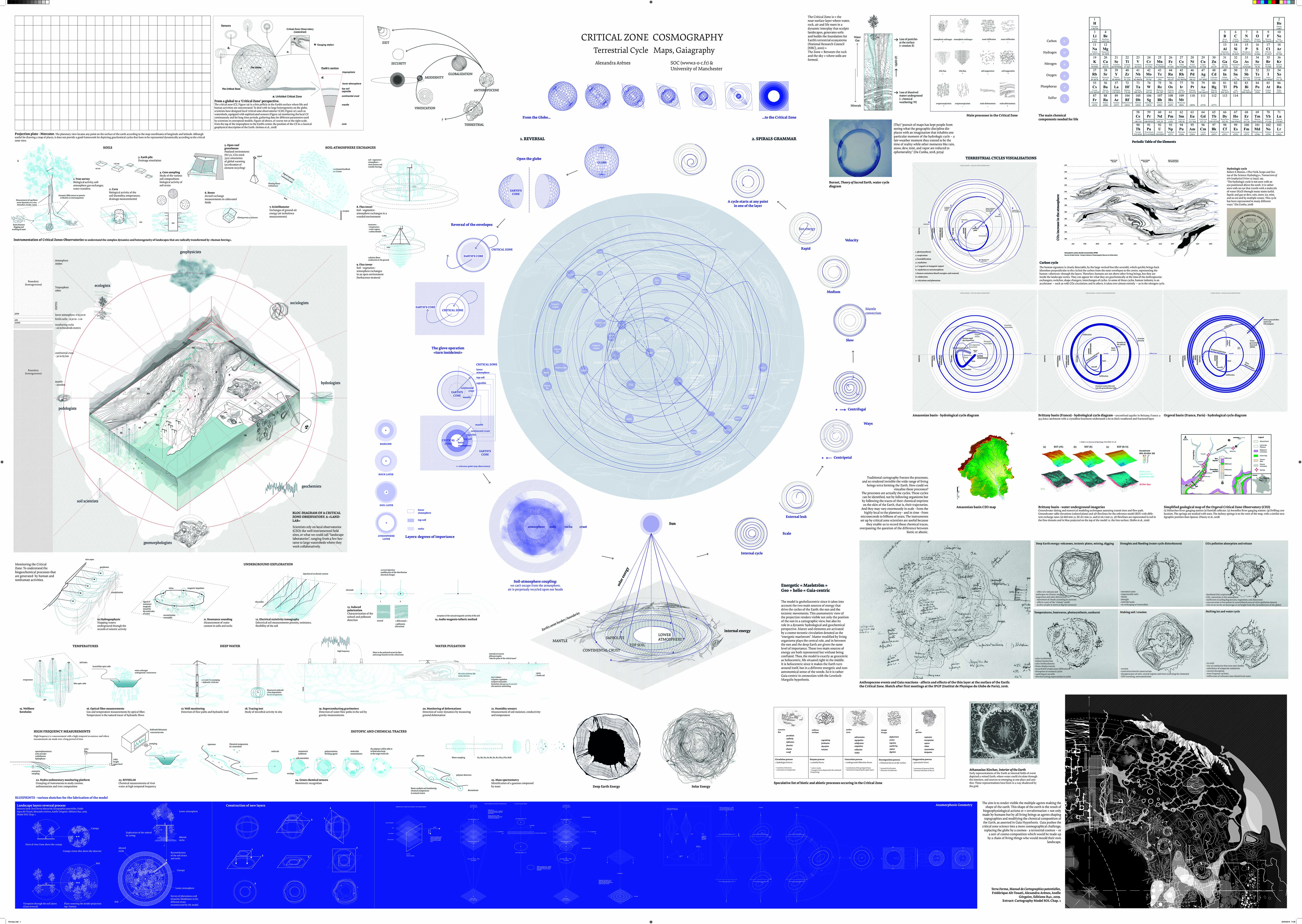
PhD thesis. “Architectural Design at the Time of Anthropocene: Reporting from the Critical Zone”. A thesis submitted to The University of Manchester for the degree of Doctor of Philosophy in the Faculty of Humanities, 2022
The idea
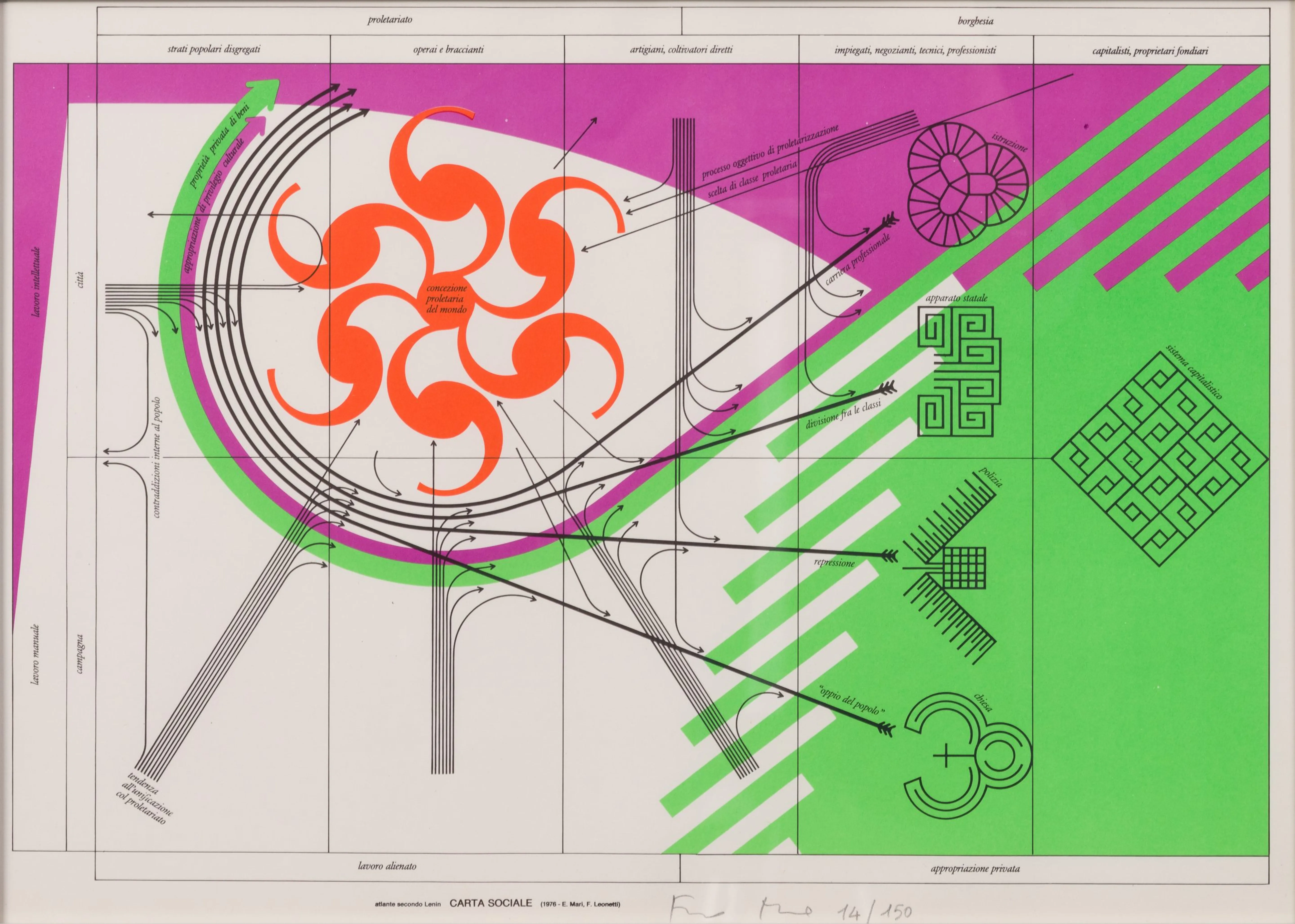
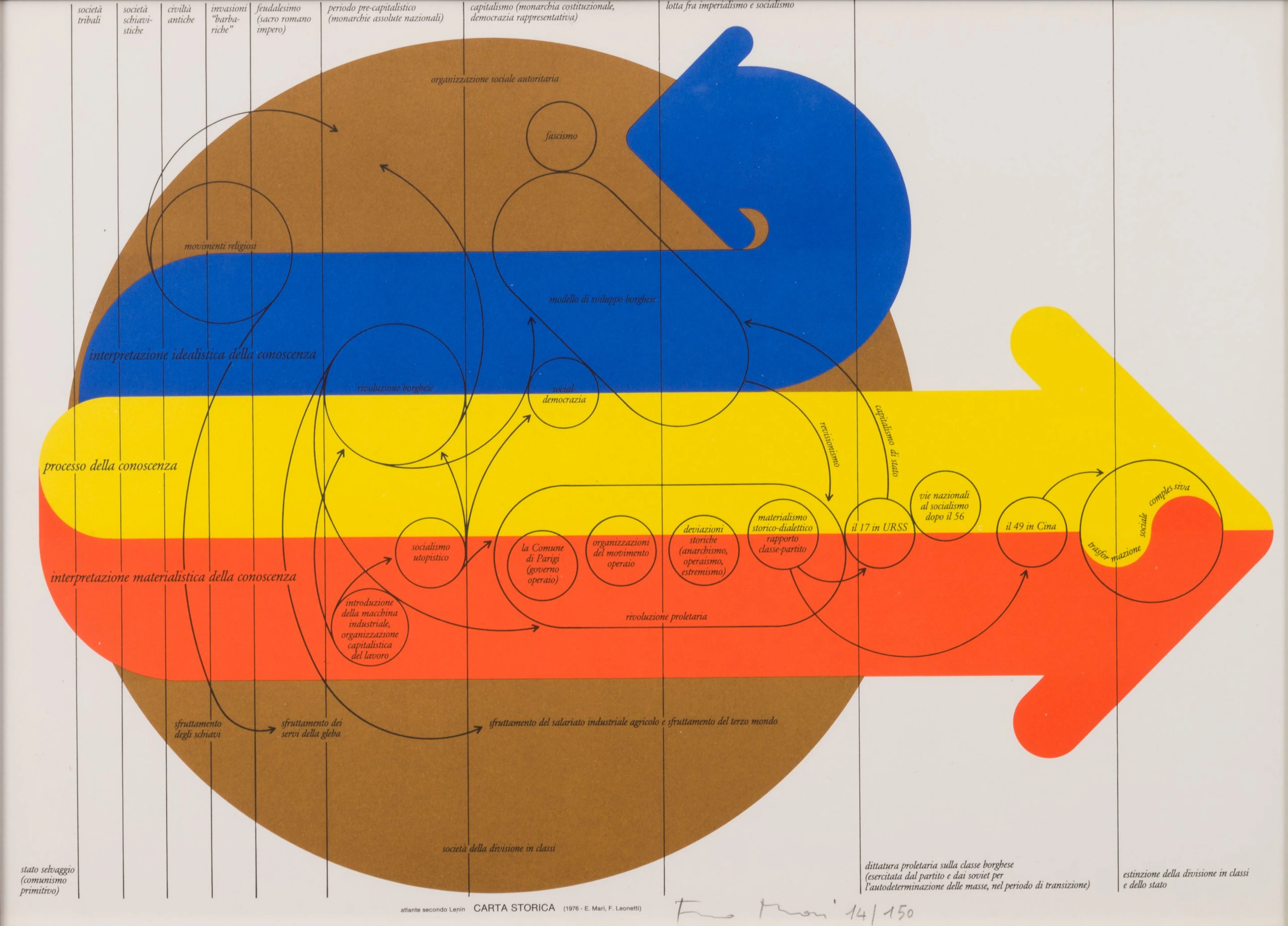
Beautiful maps of climate change stuff reminds me of Mari’s maps
The environmental crisis changed considerably the daily practices of landscape designers at the time of the Anthropocene, renewing attention to granular elements such as chemicals, sand, nutrients, water, earthworms, fungi, etc. The habitability of our planet depends on these various entities and their entanglement. With the “intrusion of Gaia” (Stengers), two visions of nature collide: the anthropocentric view, which perpetuates an idea of nature as a passive body, a background of human activities, and the cosmopolitical view, whose approach aims to better understand this intrusion of Gaia. This thesis first identifies which ideas, tools, designs and visual regimes contribute to perpetuating an anthropocentric vision of nature, and which ones, conversely, construct the cosmopolitical approach, through the variability, the agency, the complexity and the plurality of natural entities. However, this approach is yet to be developed. This is why this thesis aims to bring new, cosmopolitical insights into what a landscape is, what composes it.
To address these questions, I have undertaken empirical fieldwork using ethnographic methods, following scientists of a specific branch of earth sciences called the Critical Zone (CZ). The specificity of CZ science is the instrumentation of landscapes. In observatories, geoscientists decompose landscapes, through their observations of the soil, the rivers, and the atmosphere.
//////Download PDF
This thesis examines how scientific instruments and practices monitor various natural features over the long term, in order to trace their unexpected trajectories. The dissertation shows how this knowledge can bring a new understanding of territories and the Earth, more attuned to the different cycles and their overlapping dynamics.
The thesis also experiments with alternative mappings to capture the complexity of the composition of the Critical Zone. These maps, or visualisations, shift the anthropocentric view (which divides the territory and visualises it as a surface to be constructed), to a cosmopolitical view (a view from within, which deconstructs the traditional cartographic frame of reference to create a new one that takes into account the depth of the soil and different cycles). The contributions are twofold: a more nuanced knowledge of what is called ‘nature’ through visual tools, and the production of meticulous cosmograms related to the scientific object Critical Zone. It is this ensemble that can be named ‘gaia-graphy’. The production of these maps contributes to a better understanding of the dimensions of this Critical Zone and can bring a new understanding of landscapes in architecture. It can also have an impact on architectural practice and its transformative agency in the new climatic regime.
When it comes to product design, visual perception, or theories of design and the designer’s role in society, it’s impossible to ignore the work of Enzo Mari. A key figure in 20th-century design, his career began in the fifties and spanned over six decades.
Mari’s design work covered many areas, and trying to describe every aspect of it here would be impossible. The Italian achieved fame through the more than 1500 objects he designed in collaboration with prestigious companies such as Zanotta, Rexite, Driade, Alessi, Danese, Artemide, Olivetti, Ideal Standard and Flou. As well as his industrial design work, Mari also made an important contribution to the discipline’s theory and thought deeply about the role of the designer in modern society [1].
When he passed away in 2020 at the age of 88, Mari left behind a huge and varied legacy, including numerous graphic design projects, which are perhaps the least well-known part of his work.
Training and breakthrough with Arte Programmata
Enzo Mari was born in the northern Italian city of Novara in 1932, but a few years later he and his family moved to Milan. From 1952 to 1956, he studied at the Brera Academy, developing a passion for art and literature, theories of visual perception, and the social aspects of design.

Catalogue for the Arte Programmata show in Milan (1962), image by Archivio Grazia Varisco
Between the end of the fifties and the beginning of the sixties, he was part drawn to kinetic art [2], participating in the celebrated Arte Programmata show of 1962. This period marked the start of his relationship with Bruno Munari, who would heavily influence Mari’s work.

Catalogue for the Arte Programmata show in Düsseldorf (1963), image by MoMA
Mari’s output during this “kinetic” phase was based on a series of structures that he produced during the sixties. All his experiments from this period were examined in his book The Function of Esthetic Research [3] published in 1974. This research into design won him the first of five Compasso d’Oro prizes for industrial design received throughout his career.

Structures created in the sixties, images by Flash Art

The Nature Series
Mari started collaborating with Danese Milano [4] in 1957, designing many iconic items for the firm. From 1963 to 1976, he worked with the department that produced prints for the Nature Series.


La Mela, La Pera, La Mela and la Pera (1963), images by Danese Milano
The idea behind the series was to bring natural elements into the home, while at the same time debunking the idea of that a piece of art has to be a unique and expensive artefact. These works were in fact prints that were reproducible in infinite numbers for a modest cost.


La Pantera, Il Lupo, L’Orso and Il Leone (1965), images by Danese Milano
All the pieces in the Nature Series are large screen prints of natural subjects that have become iconic items of interior decoration, and many can still be purchased from the Danese Milano website.


L’Oca (1967), La Rana and Il Porcello (1976), images by Danese Milano
Iela and Enzo Mari
Enzo’s first wife, Iela Mari (the pseudonym of Gabriela Ferrario), was an author and illustrator of books [5] for children. The couple met at the Brera Academy and worked together on various publications throughout the sixties.


La mela e la farfalla, L’uovo e la gallina (1960), images by Babalibri
The books stand out for their pared-down illustrative style, with simple shapes and flat colours. No words are used in the books, and the storylines are simple and cyclical: the books don’t have a beginning or an end.


La mela e la farfalla, L’uovo e la gallina (1960), images by Babalibri
Toy designer
The children’s books that he produced with his first wife Iela were not Enzo Mari’s only foray into the world of childhood: he produced various designs for kids, mainly for toys, including the famous 16 animali, also for Danese.

16 animali (1957), image by Danese Milano
Another design was The Fable Game, a book/game aimed at stimulating children’s creativity. Released in 1965, it comprises six boards featuring animals and other elements from classic fables, and gives kids complete freedom to make and unmake different storylines.


The Fable Game (1965, 2013), image by Corraini Edizioni
Mari also designed Il posto dei giochi, a three-metre-long sheet of cardboard featuring colourful abstract decorations. It was conceived as a habitat for kids that would fire their imaginations so they could invent their own stories and characters. Both of these games are now published by Corraini Edizioni [6].


Il posto dei giochi (1967, 2008), image by Corraini Edizioni
Covers and publishing designs
Over the course of his long career, Enzo Mari also worked with publishers, providing the graphic design for book series, covers, cases and page layouts. His working relationship with Paolo Boringhieri of the Bollati Boringhieri [7] publishing house began in the fifties. Mari was responsible for the graphic design for the Universale Bollati Boringhieri series, which were characterised by minimalist covers with repeated images.


Covers from the Universale Bollati Boringhieri series, images by libraio.it
Mari also designed the I Classici Adelphi series, which also featured minimalist graphics and typography. To this day, the legacy of Mari’s original design lives on in Adelphi books.

Image by Blog Maremagnum
Enzo Mari and politics
The boundaries between the designer’s personal life and work were frequently blurred. Mari often talked about politics, thinking hard about the designer’s role in this sphere, and how they could improve society. Firmly on the political left, he was a self-described communist, although he never joined the party [8].
In 1973, he put on a show at Galleria Milano entitled, Hammer and Sickle ‒ Three ways an artist can contribute to the class struggle. The show was born out of an exercise that Mari assigned one of his students: to collect data on the prevalence of the symbol in various forms and contexts, and to design an artistic version. On display were the graphic symbols, a wooden sculpture, screen printed flags and various other print forms. The goal was to provide an insightful analysis of the relationship between form and content.


Images by Galleria Milano
To accompany the show, a catalogue was produced containing Mari’s reflections on the subject. In 2020, the show was restaged in the same gallery, and the catalogue republished, this time with the addition of contributions from other authors [9].


Images by Galleria Milano
Graphic objects
Enzo Mari designed chairs and sofas, tables and shelves, tableware, vases and many other types of objects. Some of these are very graphic, like Formosa and Timor, perpetual calendars created for Danese in the sixties.


Images by Danese Milano
Both calendars allow you to manually set the day, month and year, employing strong typography and a modernist style.
The Triennale di Milano exhibition
In the very year that he passed away, a retrospective of Enzo Mari’s work was held at the Triennale di Milano. Entitled Enzo Mari curated by Hans Ulrich Obrist with Francesca Giacomelli, it documented over 60 years of the designer’s work.


Images by Triennale Milano
The show was divided into periodic sections and also included a series of contributions from international artists and designers who paid homage to Mari through installations and new, specially commissioned work [10].
The Triennale show perfectly encapsulated the design work of Enzo Mari, and the huge legacy he has left us: a life full of experiments, reflections, designs and publications explored in a fluid and organic way. Enzo Mari believed that designers are artists and craftspeople; they create objects that combine form and function, and have a responsibility to act in a way that has a (positive) impact on society.
[1] https://theoria.art-zoo.com/barcellona-manifesto-enzo-mari/
[4] https://www.danesemilano.com/en/products/21
[5] http://www.babalibri.it/catalogo/autore/iela-mari
[6] https://corraini.com/it/autori/enzo-mari.html
[7] https://www.bollatiboringhieri.it/
[8] https://www.klatmagazine.com/design/enzo-mari-sono-comunista-interview/11567
[9] https://www.humboldtbooks.com/it/book/falce-e-martello-the-hammer-and-sickle
[10] https://triennale.org/eventi/enzo-maricurated-by-hans-ulrich-obrist/
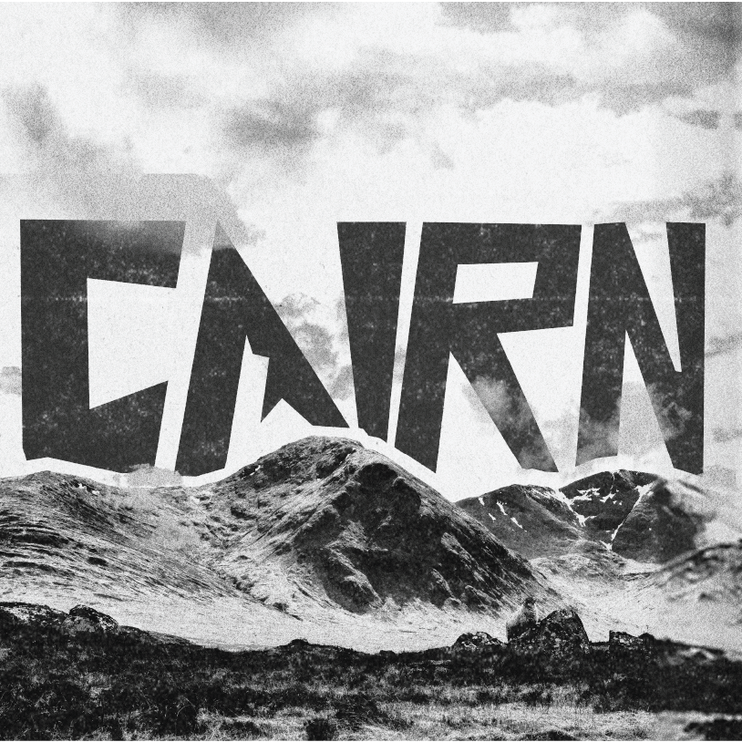
Scotland does not lack design talent.
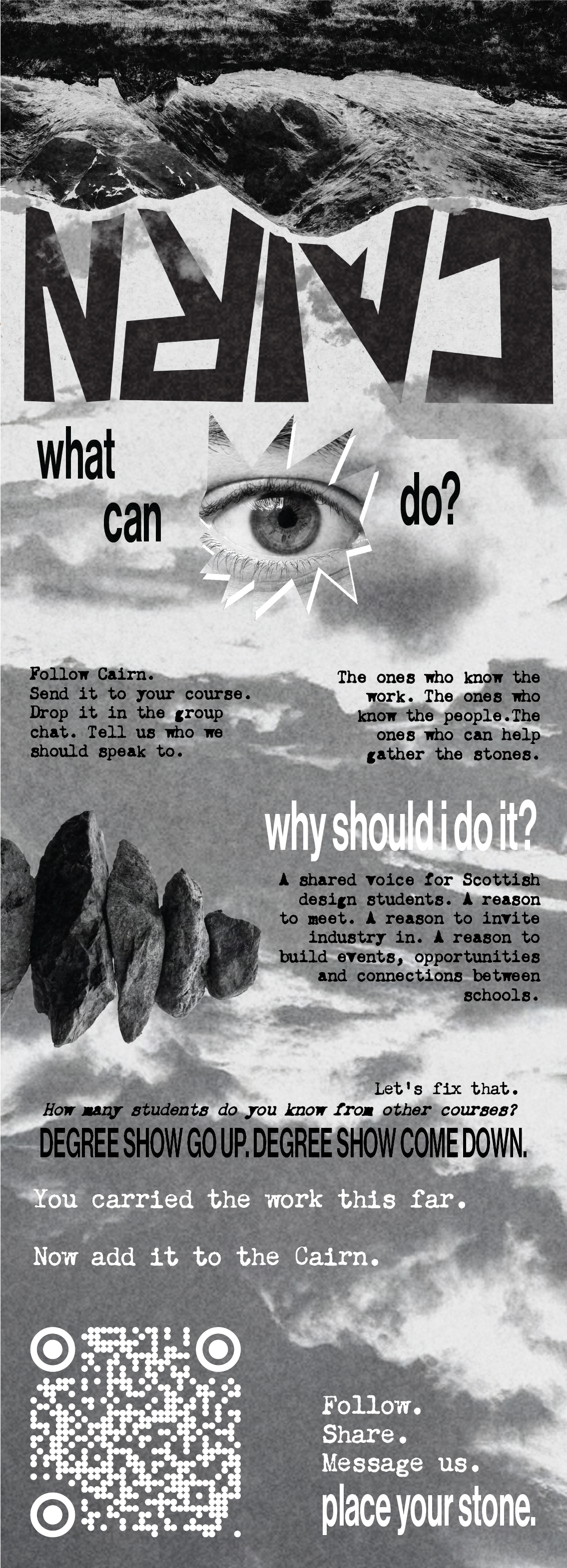
Every year, students across Scotland make ambitious, thoughtful, strange, useful, beautiful, critical and necessary work. But too often that work is seen only briefly, locally, or inside the walls of individual institutions. It appears at degree shows, in portfolios, in assessment rooms, and then disappears into scattered websites, social feeds, private networks, or jobs elsewhere.
CAIRN exists to gather that work and make it harder to ignore.
What CAIRN is
We are creating a yearly print publication that represents student design work from across Scotland. Each participating student is given equal space: their name, contact, major project, and one hero image. Students are listed alphabetically, not divided by university, course, discipline, reputation, or perceived prestige.
CAIRN is not a prize.
It does not rank students. It does not decide whose work matters most. It does not reproduce the hierarchies already present in design education and industry. It is a record, a directory, a platform, and a collective statement of presence.
Visible to itself
We believe Scottish student design should be visible to itself.
Students in Glasgow, Edinburgh, Dundee, Aberdeen, the Highlands, the Islands, and beyond should be able to see themselves as part of the same wider design culture. Not isolated cohorts. Not competing institutions. Not distant satellites of London. A connected field of young designers working in and from Scotland.
Beyond London
Too often, leaving Scotland can feel like the obvious next step. The serious step. The ambitious step.
The centre of UK design is still too often imagined elsewhere. Conferences, industry networks, graduate opportunities and cultural attention repeatedly point south. Even student events that claim to represent the future of design can become expensive, inaccessible, and London-centred by default. For Scottish students, participation often costs more, takes longer, and quietly reinforces the idea that legitimacy lives somewhere else.
CAIRN rejects that idea.
Scotland should not be treated as a place designers are educated before they leave. It should be a place where designers can begin, work, collaborate, build studios, find clients, shape communities, and contribute to a serious design culture.
Recovering confidence
Scotland once held its design reputation and self-regard high. Through industry, publishing, engineering, textiles, civic life, architecture, craft, education and making, Scotland has a deep history of design confidence. We are not trying to invent Scottish design from nothing. We are trying to help recover its confidence and make its contemporary student talent visible.
CAIRN is not nostalgia.
It is a claim on the future.
What we want
We want students to feel excited about working in Scotland. We want industry to see the talent already here. We want younger designers to see what is possible. We want institutions to look beyond themselves. We want funders, councils, studios, educators and cultural organisations to recognise that Scottish student design has a voice worth supporting.
More than a publication
The publication is only one part of this.
CAIRN will also host events, conversations and gatherings that bring students together, collect their voices, and make visible what they need from the sector around them. These events are not decoration. They are a way of proving demand, building confidence, and showing that a wider Scottish design platform is needed.
Proving a voice
CAIRN is designed to continue, but its first purpose is to prove a voice.
The first issue should act as evidence: evidence of talent, ambition, frustration, possibility, and appetite. It should help make the case for future funding, future events, and the larger ambition of a Scottish Design Week.
CAIRN should
- Connect design students across Scotland.
- Represent students equally, putting work ahead of institution.
- Show the major work of Scottish design students from that year.
- Champion Scottish design and contribute to the growth of the sector.
- Challenge London-centric ideas of where design culture happens.
- Make staying, working and building a design future in Scotland feel possible.
- Introduce students to industry, and industry to students.
- Give students a voice through essays, events and shared platforms.
- Inspire younger designers.
- Look good, feel exciting, and be worth keeping.
- Create evidence for future funding and support.
- Be built so that it can be inherited by new voices each year.
CAIRN should not
- Make its founders the important thing.
- Become a vanity publication.
- Rank students or value some work above others.
- Treat some institutions, courses or disciplines as more important than others.
- Extract work, images, ideas or cultural value from students without giving back.
- Pretend publication alone is enough.
- Become fixed in one voice.
- Reproduce the unfairness already present in design education and industry.
for more see Manifestos
These rules for the studio are in the DFC studio at ECA.
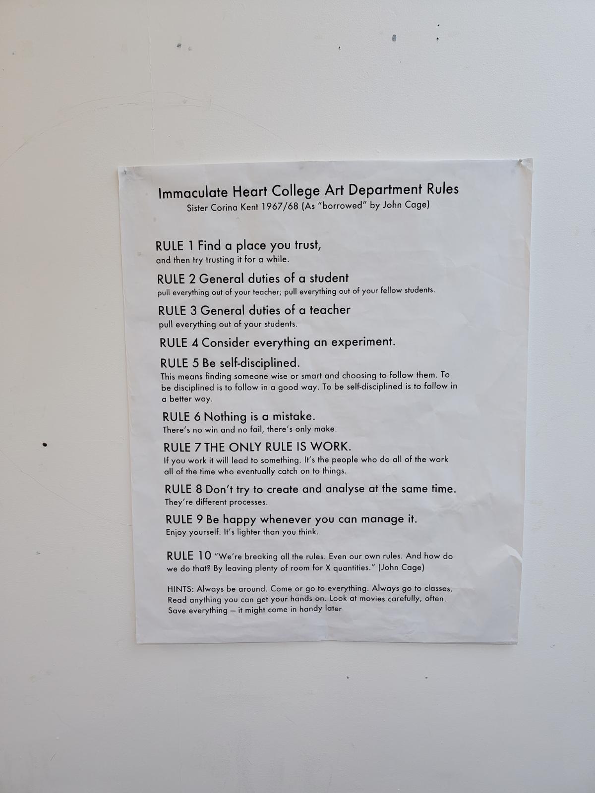
They come from the Immaculate Heart College Art Department. I like them I think, maybe they are not perfect but they are good and functional and flexible. I’d say they belong in most learning environment studios. Which in my minds should be all studios really, and then maybe this doesn’t work so well as we don’t always have a “teacher” in real life. also rule 5, self discipline is still a mystery to me. I am being of compulsion it seems. Even when hit with a stick I just find another carrot to follow.
However, I am down a new rabbit hole of manifestos! I found a great resource today designmanifestos.org A great list of manifestos from design and art movements all over the world. Some highlits include archizoom-superstudio & Enzo Mari’s Barcelona Manifesto
the latter furthering my crush for Enzo Mari
I do not fully understand these maps by Enzo Mari & Francesco-Leonetti yet But I would love to translate them and print them out. they look amazing. The plates of Atlante secondo Lenin (1976) are six radical, color-coded lithographic diagrams that function as an “educational and emancipatory tool”. Rather than mapping physical geography, they map the structural connections, class conflicts, and ideological paths of Marxist-Leninist theory. There is 6 Maps;
- Historical
- Social
- Economic
- Geographical
- Political
- Cultural